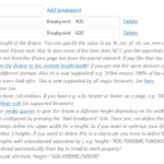
If you are not able to use auto height you can use media queries to give the iframe a different height depending on the width of the browser. This is pretty cool and can be configured by pressing the “Add breakpoint” link. There you can define the height for a certain width (breakpoint). You always define the upper width for a height. So if you want to optimize your iframe for mobile, table, desktop you can define 3 heights. If you want to define this in a shortcode you have to define first the default height. And then the other heights with a breakpoint separated by |. e.g. height=”800,1000|800,1500|400″. Please note that the breakpoints will be ordered automatically from big to small to work properly!
Screenshots of the administration
You can can configure this in the administration on the basic tab.
Example
Below the default height is 600. If your browser has a width lower than 900 the height will be 400px. If lower than 600px it will be 200px only.
The used shortcode is:
[advanced_iframe src="//www.tinywebgallery.com/blog/advanced-iframe" use_shortcode_attributes_only="true" width="100%" height="600,400|900,200|600"]
